Visualising tracked cells#
The central area of the interface presents various visualizations. The visualisations are displayed after a successful run of the algorithm (see Run track2p through the GUI), or alternatively, if results of a previous run are loaded (using File > Load processed data)
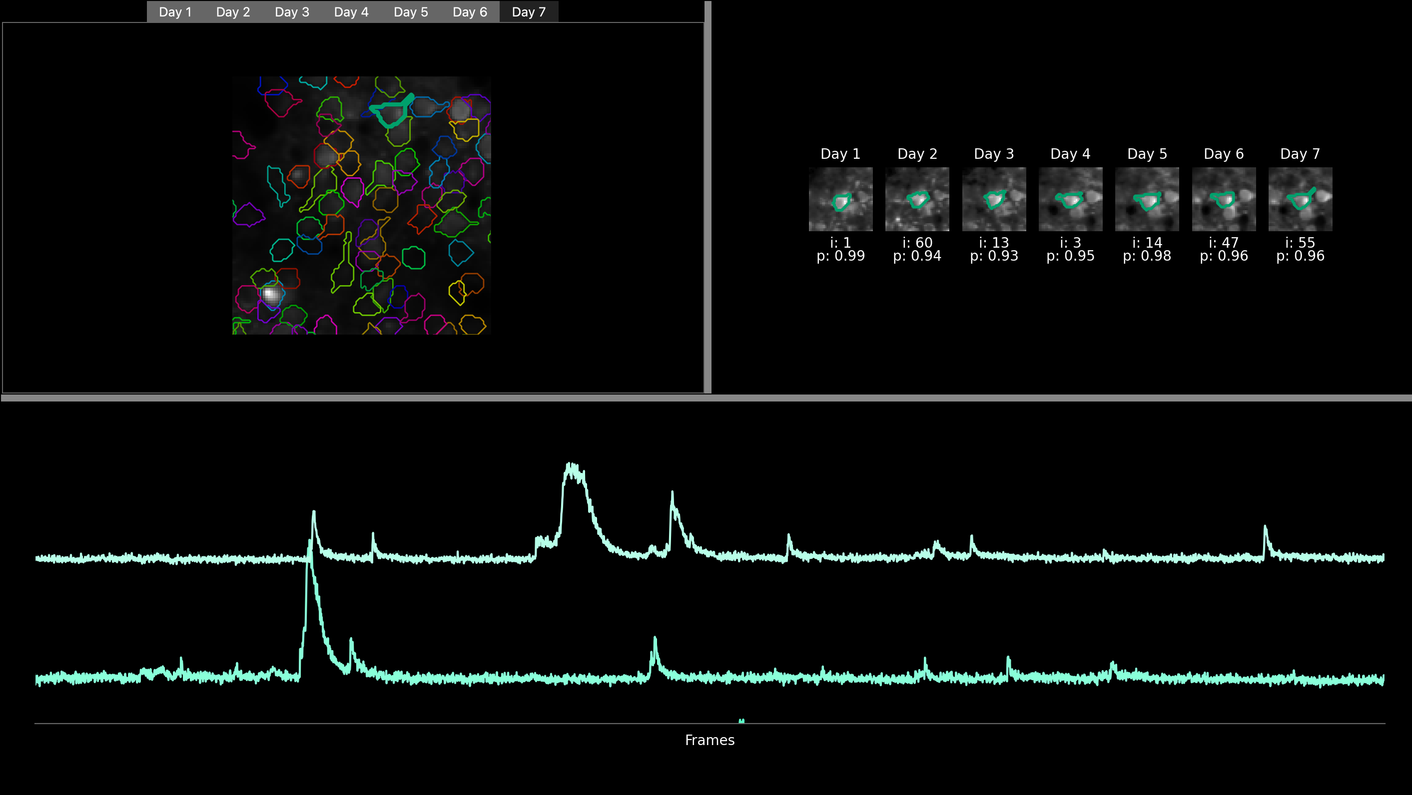
In the top left part, users can find a mean image displayed for each recording, labeled with the corresponding day number (e.g., day1, day2, etc.). Each image is also overlayed with the ROIs of the cells that are matched across all days, with the color of a particular match staying the same across days. Users can navigate through these images across days by clicking on the tabs representing each day. Additionally, users have the option to zoom into specific regions of the image and click on individual ROI to highlight it.
Once a ROI is selected, a cropped, zoomed-in view of a small surrounding part of the field of view is visualised for each day and displayed in the top right-hand corner with the ROI of the selected ROI highlighted.
At the bottom of the GUI, users can view the fluorescence trace of the selected ROI for each recording. The tracks are organized chronologically, with the track at the top corresponding to the first day of recording, followed by the following days. To further analyze these traces, users can zoom in by drawing a rectangle from the bottom left corner to the top right corner of the trace. After drawing the rectangle, they can zoom in by pressing ‘enter’ and zoom out by pressing ‘r’.
Here, the user has zommed on a specific ROI as well as on the fluorescence of the two first days (recording of developing mouse barrel cortex for consecutive 7 days)